

Empowering Efficiency: Unraveling Energy Consumption Optimization


Overview:
In pursuing a more sustainable future, understanding and optimizing energy consumption is paramount. "Empowering Efficiency: Unraveling Energy Consumption Optimization" takes you on a transformative journey into energy analytics, illuminating pathways toward a more efficient and eco-conscious world.
Tech Stack:
Cloud storage Bucket: Store historical energy consumption data in Google Cloud Storage for easy access and retrieval.
Big Query: Analyze the data for advanced data analysis and insights
Looker Studio: Visualize and explore data to identify areas of inefficiency and energy consumption patterns.
Looker Studio Dashboards: To gain insights into energy consumption trends.
Setup
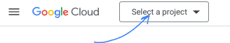
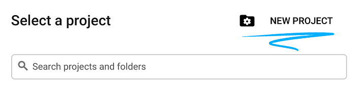
Create a new Google Cloud Project:
Sign in or sign up to Google Cloud Console. Store the project ID for further use cases.
Start the Google Cloud Shell, a remote shell environment in cloud.

Create Environment variables for REGION and PROJECT_ID.
export PROJECT_ID=<your project id>
export REGION=asia-south1
Enable BigQuery API:
Use the below command to enable bigquery
gcloud services enable bigquery.googleapis.comIngest Energy Consumption Data into BigQuery:
We will implement storage of energy consumption data in BigQuery and build analytics and reporting on top of it using Looker Studio
Format and Prepare Data:
You can find the CSV file in this GitHub repo
Use this command and clone the repository https://github.com/kaustu88/Empowering-Efficiency.git
Load Data into Google storage:
To upload a file to Google Cloud Storage using the command line, you can use the
gsutil cpcommand. Assuming you have theWorld Energy Consumption.csvfile on your local machine and you want to upload it to theenergy_consumption_bucket_databucket, the command would look like this:is:
 # Clone the Git repository
 git clone https://github.com/kaustu88/Empowering-Efficiency.git

 # Now, you can use gsutil to interact with Google Cloud Storage
 gsutil cp "path/to/World Energy Consumption.csv" gs://energy_consumption_bucket_data/
Replace
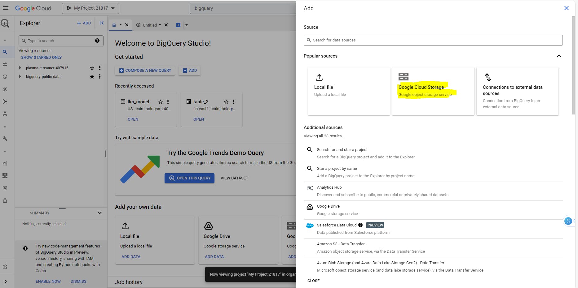
"path/to/World Energy Consumption.csv"with the actual path to your local CSV file. This command will upload the CSV file to the specified Google Cloud Storage bucketIn the GCP Console, go to the BigQuery section. Go to Add your data select Google Cloud storage select your file from GCS Bucket and select the file format. Create a dataset and click on "Create Table".
4. Build Analytics and Reporting Using Looker Studio:
Set Up Looker:
Access Looker from the Looker application URL provided.
Connect Looker to your BigQuery dataset by providing the necessary connection details.
a.Select Blank Report
b. In the Add Data to Report section Select the Google connector as "Big Query".
c.Select your "Project", your "Dataset" and your "Table" and click "Add".
Now you see a Looker studio reports have been created for the data we uploaded in the cloud storage bucket.
Create Dashboards and Reports:
- Use Looker's intuitive interface to create dashboards and reports.
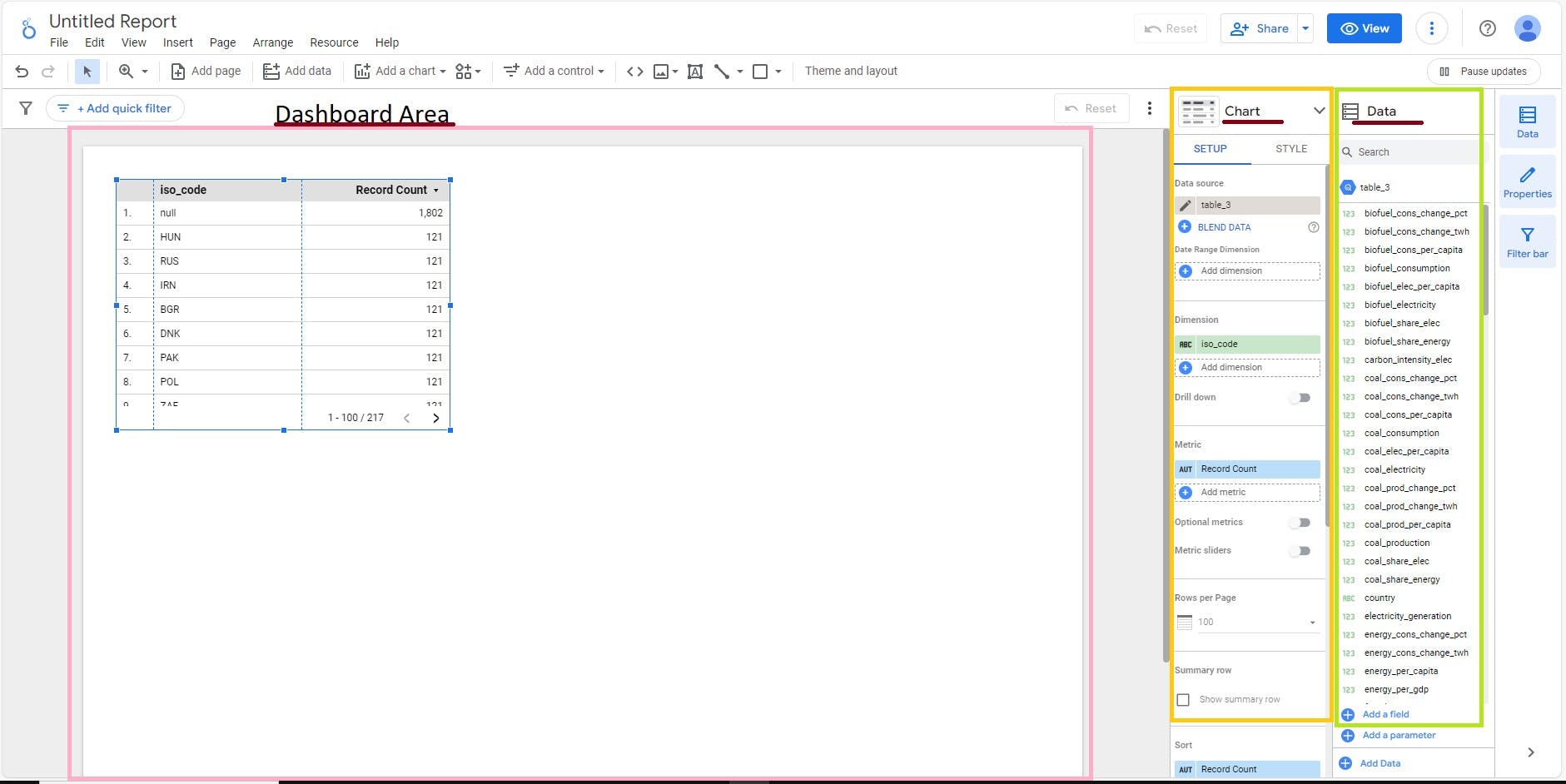
In Looker Studio, building charts, and dashboards are incredibly user-friendly. You can create charts by dragging fields from the Data Area onto the dashboard area, where Looker Studio automatically generates the chart. Afterward, refine the chart in the Chart area using SETUP for configuration and STYLE for customization. This intuitive process allows for effortless and quick visualization customization.
Drag and drop fields onto the canvas to create visualizations.
Customize the layout, apply filters, and set up interactive elements as needed.
Let’s start with a combo chart.
A scorecard serves as an excellent foundation, akin to selecting a headline, to kickstart your project. To add a scorecard that shows the total electricity generated to your report:
Click "Add a chart" icon in the toolbar, then select "Scorecard".Since the number looks too long, customize the scorecard to display a compact number by ticking the Compact number checkbox in the Style tab on the right panel
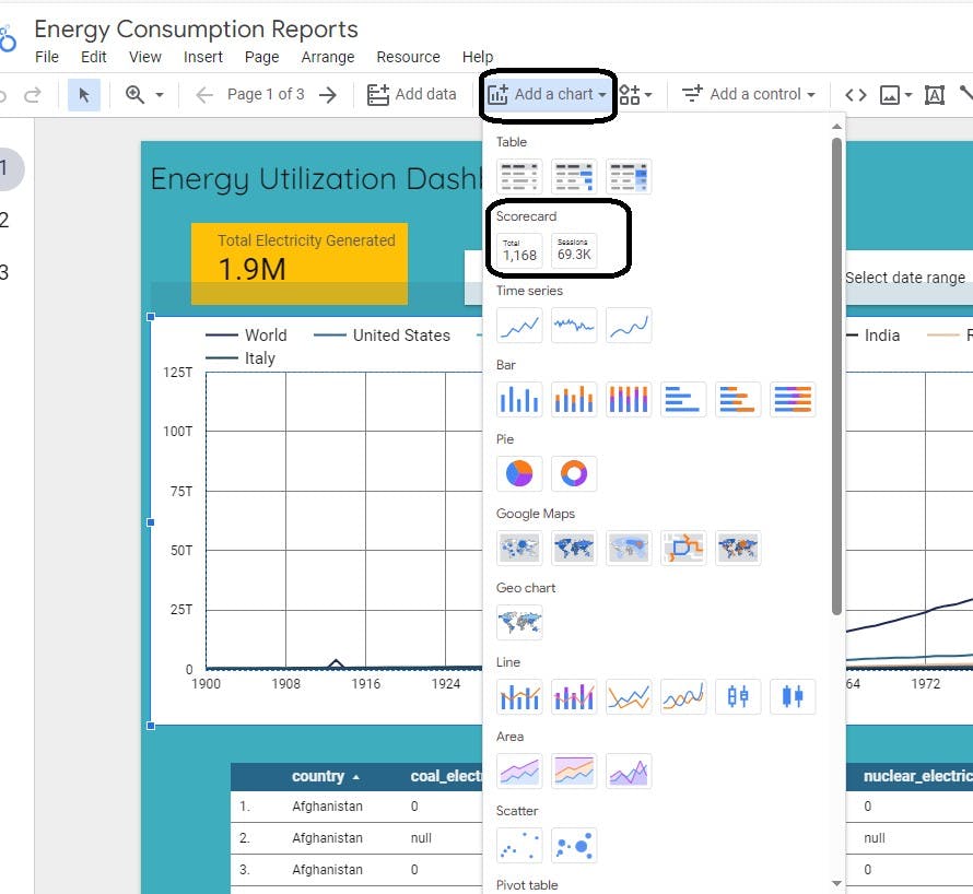
We can use "Add a control" and select "Drop down list" to have filters on "Country" or to have the option to select "date range".
I want to show the country's energy utilization each year along with the number of records in the dataset to check the reliability of the data.
Drag “Year” from the Data Area to the Dashboard Area. The “Record Count” may be added automatically. If the “Record Count” is not in the Metric, drag it from the Data Area to the chart. Dimension and Metric in the Chart Area should look like this.
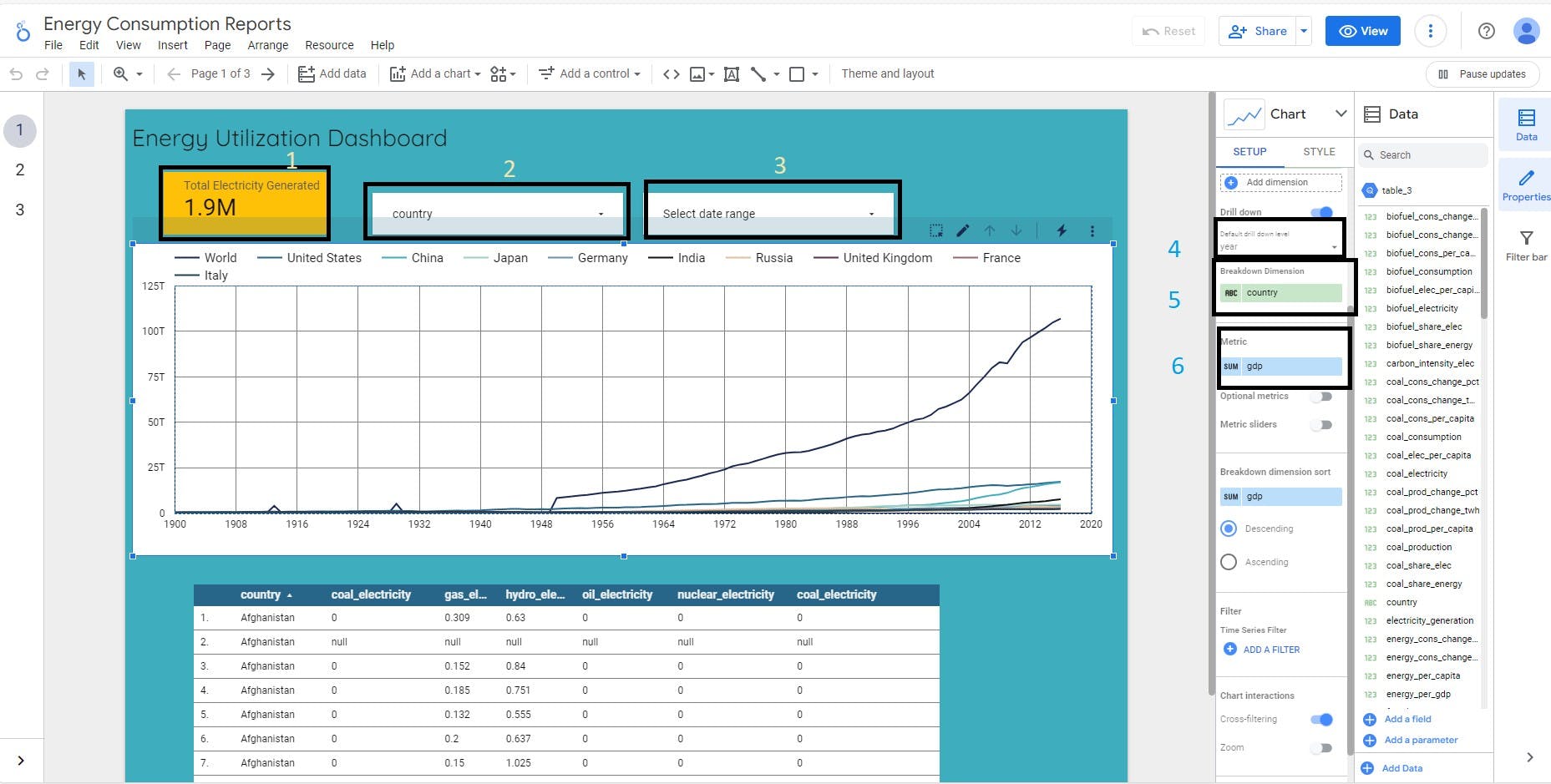
Next, create a column chart
I want to insert a new page to my report so go to "Insert" and select "New Page".I want to compare the country wise different types of electricity production.
To create a column chart for country-wise production reports, drag the “Country” from the Data Area to the Dashboard Area. Then, drag “oil_electricity”, "gas_electricity", "coal_electricity", "Nuclear" electricity", "hydro_electricity" to the chart.
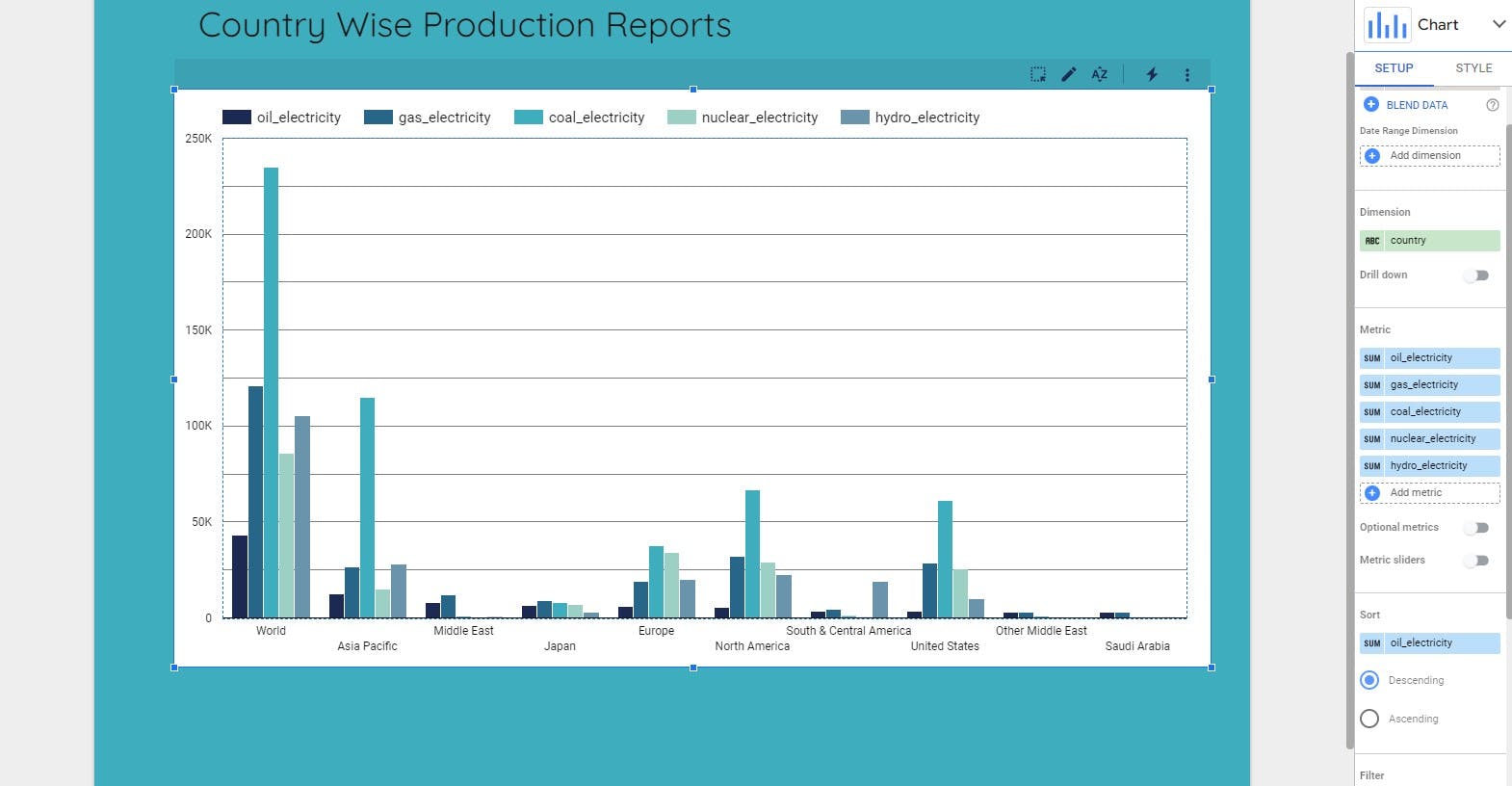
This dashboard now shows the country-wise production reports for five different types of electricity.
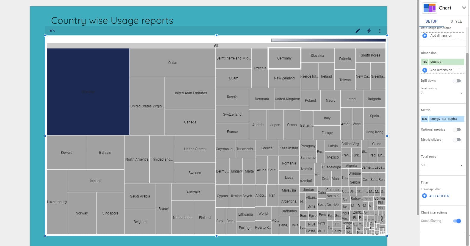
I have added a new page and tried the heat-map option to show the country-wise usage reports for the different types of electricity.
Make the dashboard beautiful
There is a lot of detail in a dashboard design. I will cover only some parts which are simple but can make a great impact.
- Change theme
Click on the Theme and Layout button and select the theme.

Change theme
Arrangement
Text/Chart size
After selecting a chart, click on the STYLE tab under the Chart Area. Explore this tab to adjust chart color and text style
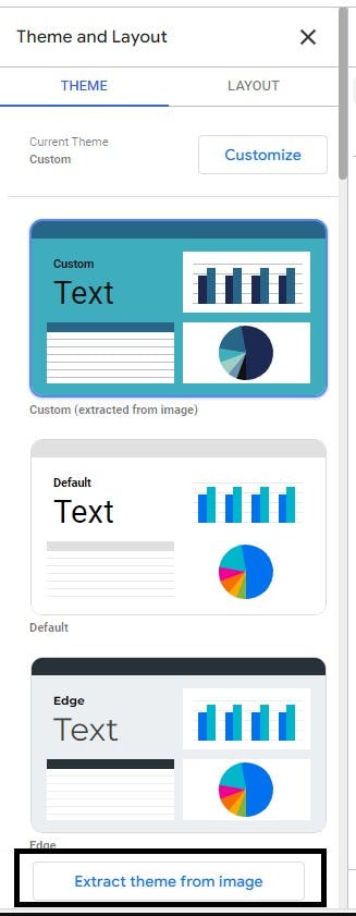
In my exploration of the tool, one feature stood out vividly and piqued my interest: "Extract theme from image." Intrigued, I decided to put it to the test. I selected a random image from the vast expanse of the internet and delved into the color combination options derived directly from that image. It was a creative revelation, allowing me to infuse the essence of the chosen image seamlessly into the dashboard's design palette. This innovative feature not only simplified the process but also added an artistic touch, transforming a mere dashboard into a visually captivating masterpiece.
To share your report, click on the Share dropdown in the header toolbar. This will give you a list of different ways to share it:
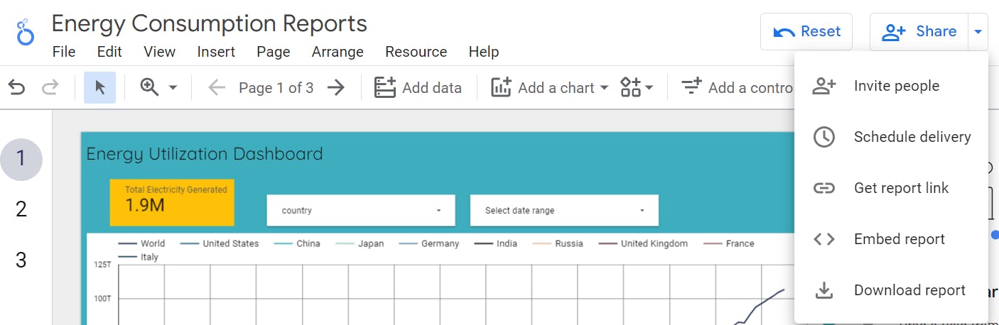
Option 1: Invite People
Extend invitations to individuals or Google Groups, seamlessly integrating them as viewers or collaborators for targeted sharing.
Option 2: Schedule Email Delivery
Take the hassle out of sharing by scheduling email deliveries of your reports in convenient PDF formats, tailored to your preferred frequency.
Option 3: Get Report Link
Generate a quick, shareable link for your report, allowing for effortless distribution with flexible control over access settings.
Option 4: Embed Report
Easily integrate your report into web pages by enabling embedding, selecting preferred modes and sizing for seamless incorporation into online platforms.
Option 5: Download Report
Download reports as PDF files for tangible distribution via email, Slack, or other platforms; enhance security by adding an optional password layer.
While we've just scratched the surface in this article, I trust this Looker Studio tutorial served as a valuable launchpad for your journey. Looker Studio is a treasure trove of features, and our exploration doesn't end here. There's a vast expanse of possibilities waiting for you to delve into, so don't let your exploration cease at this juncture. Happy discovering!